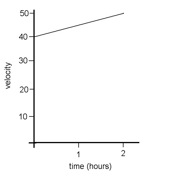
Today we got started on chapter 3. This is the problem we looked at in class:
Manny is driving through the USA to Fargo. Between noon and 2pm his speed increases steadily from 40mph to 5mph.
1)Draw a graph of his speed over time.
2)Estimate his minimum distance travelled.
3)Estimate his maximum distance travelled.
1)
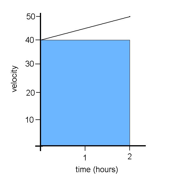
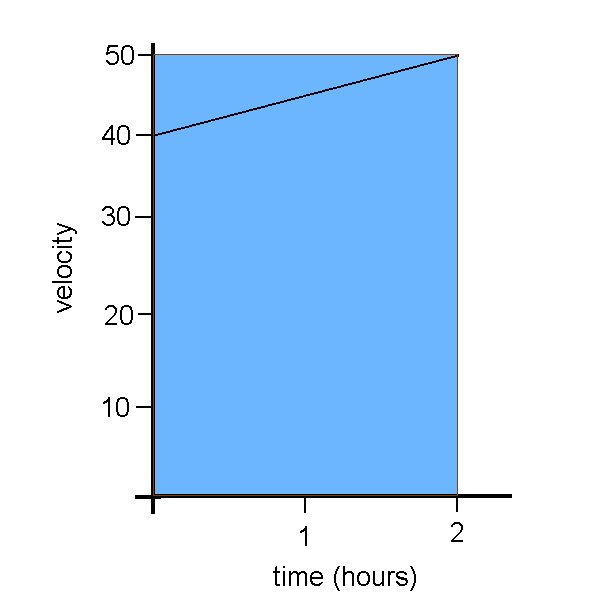
2) d=vt 3) d=vt
=(40)(2) =(50)(2)
=80 miles =100 miles
So, how did we get the answers for questions 2 and 3?
First, we are looking for the minimum possible distance travelled over the entire 2 hour period. We know that he was travelling at at least 40 mph throughout the entire trip. So by using the formula d=vt, (which most people probably know from physics) we get our answer. We know that there is no way that Manny could have travelled less than 80 miles. But because we know that he travelled at more than 40 mph as the trip went on, we know that 80 miles is an underestimate.
The same applies to question 3. We know that Manny was never travelling more than 50 mph throughout the trip. So he can't possibly have travelled more than 100 miles in that time. And because we know that it was only at the end that he reached a speed of 50mph, we know that 100 miles is an overestimate.
So now we know that the distance travelled over 2 hours is somewhere between 80 and 100 miles. We can also look at the solution to these questions from a graphical perspective.
2) 3)
In grade 10 science most of us learned that we could find distance on a velocity-time graph by finding the area underneath the line. This is exactly what we did to solve for questions 2 and 3, except that now we are no longer dealing with nice, happy horizontal lines. So the minimum and maximum possible values we found earlier don't show us the exact distance travelled, because we are not considering the rate of change in our answers. Instead, we're saying:
If the velocity had been 40mph over the entire trip then the distance would be 80 miles.
If the velocity had been 50mph over the entire trip then the distance would be 100 miles.
This only gives us a rough estimate of the actual distance travelled. The area is either underestimated or overestimated, our margin of error is shown by the white triangle under the first graph, and the blue one over the second graph.
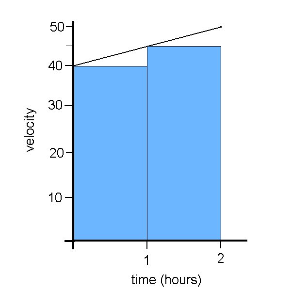
So, the next step is: how do we make our answer more accurate? What if we use the same method as before, but look at each hour seperately? We get these graphs:
2) 3)

And by calculating the total shaded areas and adding them together, we find:
2) d1= (40)(1) d2= (45)(1) 3) d1= (45)(1) d2= (50)(1)
total d= 85 miles total d= 95 miles
Before we knew that the total distance travelled was between 80 and 100 miles.
Now we know that the total distance travelled is between 85 and 95 miles.
So we have narrowed down our error by half, from 20 miles to just 10.
We can also see the margin of error decreasing from the graphical perspective, as we see the triangles showing underestimation or overestimation are decreasing in area.
And if I were to feel up to making even more graphs, with more lovely blue rectangles, an even more accurate answer could be found.
Now, imaginate that we have an infinite number of little blue rectangles on our graph. The margin of error approaches zero, and we have an accurate answer, which makes us very happy :) In other words, we're just finding the exact area underneath the line.
Now, for a bit of technical stuff. How do we know if we are underestimating or overestimating?
When the graph is increasing, like the one in our example today:
If we take the areas using velocities starting from the left, the answer will be an underestimate.
If we take the areas using velocities starting from the right, the answer will be an overestimate.
When the graph is decreasing:
If we take the areas using velocities starting from the left, the answer will be an overestimate.
If we take the areas using velocities starting from the right, the answer will be an underestimate.
And the new term of the day is Monotonic. This means that the function is always increasing or always decreasing.
Tomorrow's scribe is Linger. Happy Haloween tomorrow, everyone.
And I can't get this to look quite the way I want, so I'm sorry if there are weird unecessary spaces or the numbers get squashed. I don't know how to fix it.


3 comments:
Your post was easy to read suzanne and I like it. How do you people make your graphs? I don't have paint or anything like that, which makes it harder. I was actually happy with todays class because I actually understood the work. Calculus is showing up in a lot of my other classes. Like in my chem class, we're finding the rate of change of chemical reactions. Todays class was almost exactly like what showed up on my physics test. Which had something to do with impulse and finding the area of the different parts on the graph. It's kind of like that "light bulb" moment.
Suzanne, for someone who wasn't aware that they were scribe until 7 something last night, you have a really good post! I think it deserves to be in the hall of fame, because it covered everything we talked about in class. I agree with Ashlynn that calculus shows up in other class, as well as physics showing up in our calculus classes... funny how it all relates to each other. Anyway, I'm glad I caught your fall today, because I know you would have done the same thing for me... good job on your post again =) Keep it up ;)
Hall of Fame worthy.
Post a Comment